The Exact Resume Margins, Font Size, and Spacing Settings
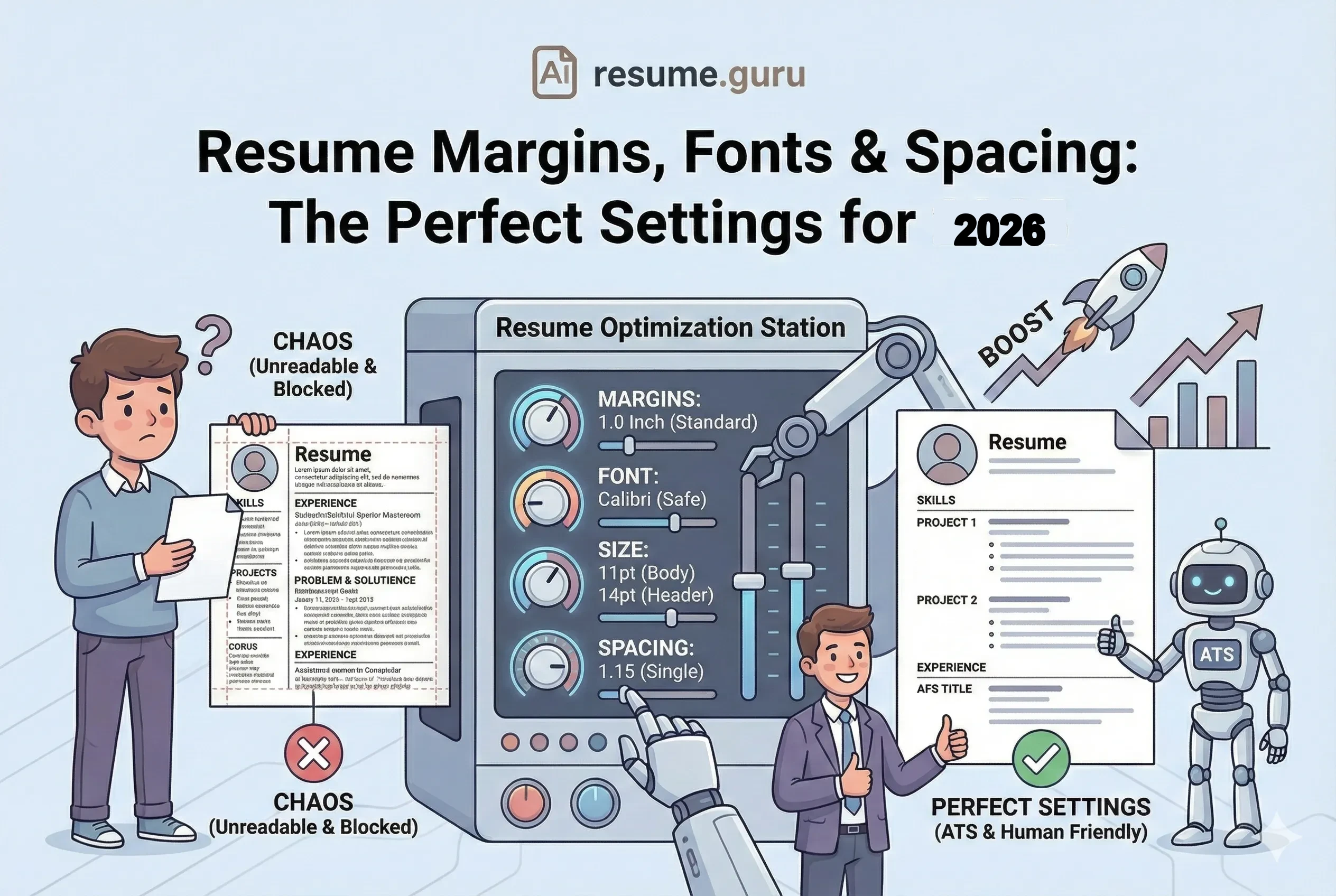
The short answer: the ideal resume formatting in 2026 is 1-inch margins, 11pt Calibri or Arial, and 1.15 line spacing, with 14-16pt section headers and an 18-24pt name. Those settings parse cleanly in every major ATS (Workday, Taleo, Greenhouse) and stay readable on screen and in print. Never drop below 0.5-inch margins or 10pt body text.
You’ve written killer achievement-focused bullet points. Your summary is compelling. Then you send it in a decorative font with 0.3-inch margins, and the recruiter can’t even read it.
Of resumes flagged
For formatting issues before content is even reviewed
Source: CareerBuilder Survey
Formatting is the invisible killer of resumes. Get it wrong, and your content doesn’t matter—ATS can’t parse it, and humans can’t read it.
Here are the exact specifications that work. Not sure whether yours already match? Score your resume now and the formatting checks run first.
The Perfect Settings
- Margins: 1 inch standard, 0.5-0.75 inch minimum
- Body Font Size: 10-12pt (11pt ideal)
- Header Font Size: 14-16pt
- Name Size: 18-24pt
- Line Spacing: 1.0-1.15 (single)
- Font: Calibri, Arial, Helvetica, or Georgia
Margins: How Much White Space Is Right?
Margins control the white space around your content. Too wide and you waste space. Too narrow and your resume looks cramped — and cramped margins are also what squeeze out the hyperlinks in resume PDFs that recruiters actually click.
The Standard: 1 Inch All Around
Default Setting
1-inch margins on all sides (top, bottom, left, right) is the safe, professional standard. It’s what most ATS systems expect and what looks best when printed.
When to Adjust
| Margin Size | When to Use | Risk Level |
|---|---|---|
| 1 inch | Standard—use by default | Safe ✅ |
| 0.75 inch | Need slightly more content space | Safe ✅ |
| 0.5 inch | Absolute minimum for tight content | Borderline ⚠️ |
| < 0.5 inch | Never | ❌ Content clips |
The “Fit Everything” Myth
Don't Do This
“I’ll just shrink the margins to fit everything on one page.”
This creates a wall of text with no breathing room. Recruiters unconsciously pass over cramped resumes—even if the content is great.
Better approach: Cut weak content instead of shrinking margins. See our guide on resume bullet point length for how to say more with fewer words.
Setting Margins in Common Tools
Microsoft Word: Page Layout → Margins → Custom Margins → Set all to 1”
Google Docs: File → Page Setup → Set all margins to 1”
AI ResumeGuru Editor: Our templates have optimized margins built in—so you can focus on content, not formatting. You can also start a resume with these margins already applied and adjust font size and spacing live in the editor.
Font: What Typeface to Use
Your font choice affects both ATS parsing and human readability. For the complete guide to fonts that pass automated screening, see our ATS-friendly resume fonts deep dive.
ATS-Friendly Fonts (Safe Choices)
| Font | Style | Best For |
|---|---|---|
| Calibri | Sans-serif, Modern | Default for most templates (clean, professional) |
| Arial | Sans-serif, Classic | Universal compatibility, very readable |
| Helvetica | Sans-serif, Premium | Clean lines, design-forward (Mac default) |
| Georgia | Serif, Professional | Traditional industries, adds character |
| Times New Roman | Serif, Classic | Academia, legal, very traditional roles |
| Roboto | Sans-serif, Google | Modern, tech-friendly, excellent on screens |
| Lato | Sans-serif, Friendly | Balanced warmth and professionalism |
Fonts to Avoid
Never Use These
Decorative Fonts:
- Comic Sans (unprofessional)
- Papyrus (looks dated)
- Brush Script (hard to read)
- Impact (too heavy)
Why they fail:
- ATS may not recognize characters
- They look unprofessional
- They’re hard to scan quickly
- They may not render on all systems
Font Pairing (If Using Two Fonts)
If you want variety, follow this rule:
The Safe Pairing Rule
One font for headers, one for body—and both from the same family or style.
Examples:
- Headers: Calibri Bold → Body: Calibri Regular
- Headers: Roboto Medium → Body: Roboto Light
- Headers: Georgia Bold → Body: Georgia Regular
Never use more than 2 fonts total.
Times New Roman vs Arial: Which Resume Font Is Better in 2026?
This is the most-searched font question for resumes, so let’s settle it with a direct comparison:
| Factor | Times New Roman | Arial |
|---|---|---|
| Type | Serif (has decorative strokes) | Sans-serif (clean, no strokes) |
| ATS compatibility | ✅ Excellent | ✅ Excellent |
| Screen readability | Good but dense | Excellent — designed for screens |
| Modern perception | Dated for most industries | Neutral, professional |
| Best industries | Legal, academic, government, traditional finance | Tech, marketing, creative, startups, healthcare |
| Space efficiency | Slightly more compact (fits more text) | Slightly wider (needs more space) |
| Recruiter perception | "Classic but safe" | "Clean and professional" |
| Default in | Microsoft Word (until 2007) | Web browsers, Google Docs |
The Verdict
Use Arial (or Calibri) for most jobs in 2026. They’re modern, screen-optimised, and neutral. Use Times New Roman only for legal, academic, or very traditional government roles where serif fonts are expected.
If you want the readability of Arial with a bit more character, Calibri is the best compromise — it’s been the default in Microsoft Office since 2007 and is universally installed on every computer.
The Font Decision Shortcut
Not sure which font to use? Ask yourself: Would this company’s website use a serif font? If their site looks modern and clean, use a sans-serif font (Arial, Calibri, Helvetica). If it looks traditional (law firm, academic institution), serif is fine (Times New Roman, Georgia).
For a deeper dive on all ATS-friendly resume fonts including Roboto, Lato, Garamond, and more — with visual previews — see our dedicated font guide.
Font Size: The Hierarchy That Works
Your resume should have a clear visual hierarchy so recruiters’ eyes know where to look.
The Size Ladder
YOUR NAME          →  18-24pt (largest)
Section Headers    →  14-16pt (bold)
Job Titles         →  11-12pt (bold)
Company/Dates      →  10-11pt
Body Text/Bullets  →  10-12pt (11pt ideal)
Size Recommendations by Section
| Element | Size | Weight |
|---|---|---|
| Your Name | 18-24pt | Bold |
| Contact Info | 10-11pt | Regular |
| Section Headers | 14-16pt | Bold or CAPS |
| Job Title | 11-12pt | Bold |
| Company Name | 10-11pt | Regular or Italic |
| Dates | 10-11pt | Regular |
| Bullet Points | 10-12pt | Regular |
| Skills | 10-11pt | Regular |
The 10pt Floor
Never go below 10pt for any text. It becomes unreadable—especially on printed copies or when PDFs are compressed.
If you can’t fit everything at 10pt+, you have too much content. Edit it down.
Line Spacing: Creating Breathing Room
Line spacing (leading) controls the vertical space between lines of text.
The Rules
| Where | Spacing | Why |
|---|---|---|
| Within bullet points | 1.0 - 1.15 | Keeps content tight and scannable |
| After job entries | 1.5 lines or 6-8pt | Visual separation between roles |
| Between sections | 12-18pt or double line | Clear section breaks |
Spacing Best Practices
- 1
Use single spacing (1.0-1.15) for body text
This is standard for resumes. Double spacing wastes space and looks like you're padding.
- 2
Add extra space between sections
12-18pt of space before each new section header creates visual hierarchy.
- 3
Keep bullet points tight
Bullets within the same job should have minimal spacing (0-3pt between them).
- 4
Use consistent spacing throughout
If section A has 12pt before it, section B should too. Inconsistency looks sloppy.
Pro Formatting Tip
In Word/Google Docs, use “Space After Paragraph” instead of hitting Enter twice. This gives you precise control and keeps formatting consistent when editing.
Alignment: Keep It Simple
Do This ✅
- Left-align all body text (standard reading pattern)
- Left-align bullet points
- Center-align or left-align your name/header
- Right-align dates (optional—can also be on same line)
Avoid This ❌
- Justified text (creates uneven word spacing)
- Right-aligned body text (hard to read)
- Center-aligned bullet points (chaotic)
- Mixed alignment within sections
The Standard Layout
LEFT COLUMN                                RIGHT COLUMN
─────────────────────────────────────────────────────
Job Title                                  Date Range
Company Name | Location

• Bullet point (left-aligned)
• Another bullet point
• Third achievement
Visual Hierarchy Checklist
Before you submit, your resume should check all these boxes:
Formatting Checklist
- Name is the largest text on the page (18-24pt)
- Section headers are clearly visible (14-16pt, bold)
- Body text is readable (10-12pt)
- Consistent spacing between all sections
- Margins are at least 0.5 inches on all sides
- Only 1-2 fonts used total
- No text is cut off when printed
- Left-aligned text throughout (not justified)
Common Formatting Mistakes
Mistake 1: Inconsistent Sizes
If your first job has 12pt titles and your second has 11pt, it looks careless. Pick one size and stick with it.
Mistake 2: Too Many Font Weights
Bold + Italic + Bold Italic + Regular + Light = Visual chaos. Limit yourself to: Regular + Bold. That’s it.
Mistake 3: Decorative Elements
Fancy dividers, icons everywhere, colored boxes, gradients — they might look nice in design tools, but ATS can’t parse them and they distract from content. See our guide on special characters that break ATS for the full list of what to avoid.
Mistake 4: Tight Margins + Small Font
If you have 0.5” margins AND 9pt font, your resume is screaming “I’m trying to cram too much in.” Edit content instead.
One-Page vs. Two-Page Formatting
| Resume Length | When Appropriate | Formatting Adjustments |
|---|---|---|
| One Page | 0-10 years experience | Standard margins (1”), 11pt font |
| Two Pages | 10+ years, executives, academics | Can use slightly smaller margins (0.75”), but keep 10pt minimum |
The Two-Page Rule
If you go to two pages, make sure page two has substantial content—not just 3 lines of skills. If page two is mostly empty, edit down to one page.
Template Quick Reference
Entry-Level Resume
- Margins: 1”
- Name: 20pt Bold
- Headers: 14pt Bold
- Body: 11pt Regular
- Spacing: 1.15
- Font: Calibri
Mid-Senior Resume
- Margins: 0.75-1”
- Name: 22pt Bold
- Headers: 14pt Bold
- Body: 11pt Regular
- Spacing: 1.0
- Font: Arial or Roboto
Executive Resume
- Margins: 0.75”
- Name: 24pt Bold
- Headers: 16pt Bold
- Body: 11pt Regular
- Spacing: 1.0-1.15
- Font: Georgia or Calibri
Tools for Perfect Formatting
Skip the formatting headaches
Our resume templates have perfect margins, fonts, and spacing built in. Just add your content.
Browse TemplatesHow Formatting Translates Across File Types
Your carefully chosen margins and fonts can shift depending on how you save and send your resume:
| Format | Margins preserved? | Fonts preserved? | Best for |
|---|---|---|---|
| ✅ Exact | ✅ Embedded | Most applications — preserves everything | |
| Word (.docx) | ✅ Yes | ⚠️ Only if font is installed on recipient's system | When employer specifically asks for Word |
| Google Docs link | ✅ Yes | ⚠️ Limited to Google Fonts | Collaborative editing, internal sharing |
| Plain text (.txt) | ❌ None | ❌ None | ATS text-only uploads (rare in 2026) |
| Copy-paste into web form | ❌ None | ❌ None | Online application portals — formatting is controlled by the system |
Best practice: Always submit as PDF unless the employer specifically requests Word. PDF preserves your formatting exactly as you designed it — margins, fonts, spacing, everything. If you must send Word, stick to universally installed fonts (Calibri, Arial, Times New Roman) to avoid rendering issues on the recipient’s computer. The same caution applies if you translate your resume — accented characters can shift line breaks and reflow your carefully set spacing.
The Font Embedding Trick
If you use a less common font (like Lato or Roboto) and need to send as Word, embed the fonts: File → Options → Save → Check “Embed fonts in the file.” This ensures your font choice survives even if the recruiter doesn’t have it installed.
The Bottom Line
Perfect formatting is invisible. When it’s done right, no one notices — they just read your content smoothly. When it’s done wrong, it’s the first thing people see.
The safe formula:
- 1-inch margins
- 11pt body text in Calibri or Arial
- 1.15 line spacing
- Clear size hierarchy (name → headers → body)
- Single-column layout for maximum ATS compatibility
Once your formatting is dialled in, focus on what actually gets interviews: strong action verbs, quantified achievements, and ATS-optimised keywords. Use our Keyword Scanner to check if your resume matches specific job descriptions.
Applying internationally? Formatting rules vary — see our guides for UK CV format (A4 paper), German Lebenslauf (photo rules), and European CV format (Europass standard).
Skip the formatting headaches entirely
Our resume templates have perfect margins, fonts, and spacing built in — ATS-tested across Workday, Taleo, and Greenhouse. Just add your content.
Browse Free TemplatesRelated Resources
- ATS-Friendly Resume Fonts — Deep dive on fonts that pass ATS
- Single vs Double Column Resume — Layout decisions that affect ATS
- Using Color on Resume — Add visual appeal safely
- Special Characters & ATS — Characters that break formatting
- Resume Bullet Point Length — Ideal line length for bullets
- PDF vs Word Resume — Best format for submission
- UK CV Format — A4 formatting for British CVs
- Resume Templates — Pre-formatted professional designs
- Resume Editor — Margins, fonts, and spacing preset correctly
- Keyword Scanner — Check ATS compatibility
- Resume Examples — See formatting in context
Frequently Asked Questions
What are the best margins for a resume in 2026?
Standard 1-inch margins on all sides. You can reduce to 0.5-0.75 inches if you need more space, but never go below 0.5 inches—it looks cramped and may clip when printed.
What font size should I use on my resume?
10-12pt for body text (11pt is ideal), 14-16pt for section headers, and 18-24pt for your name. Never go below 10pt—it becomes unreadable.
What's the best font for an ATS-friendly resume?
ATS-safe fonts include Arial, Calibri, Helvetica, Georgia, and Times New Roman. Avoid decorative fonts, script fonts, or anything that requires special installation.
Should I use single or double spacing on my resume?
Single spacing (1.0 or 1.15) within sections. Use slightly more space (1.5-2.0 lines) between sections to create visual separation. Never double-space within paragraphs.
Is Times New Roman or Arial better for a resume?
Arial is generally the better choice in 2026. It's more modern, reads well on screens, and is ATS-friendly. Times New Roman is safe but can look dated for most industries. Use Times New Roman for legal, academic, or very traditional roles; Arial for everything else.
Should my resume be in A4 or Letter size?
Use Letter (8.5 x 11 inches) for US applications and A4 (210 x 297mm) for UK and European applications. Set the paper size before writing — it affects margins and line breaks.
Can I use 9pt font on my resume?
No. 10pt is the absolute minimum for any resume text. Below 10pt, text becomes unreadable when printed and may cause ATS parsing issues. If you can't fit everything at 10pt+, cut content instead.
What margin size should I use in Google Docs for a resume?
Go to File → Page Setup and set all margins to 1 inch (2.54cm). For tighter resumes, 0.75 inches works. Google Docs defaults to 1 inch, which is already correct.
Put this into practice
You have the theory. These take a few minutes and work on the resume you already have.