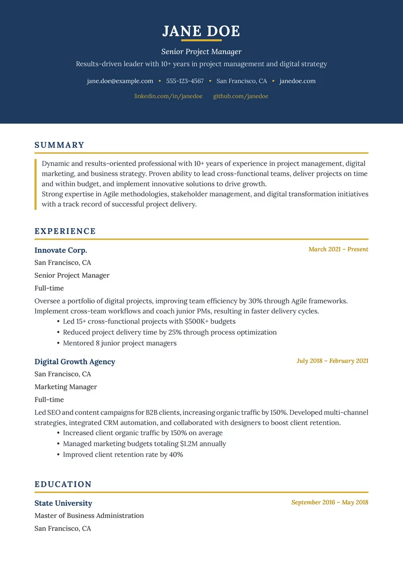
Your resume font is the voice of your career story. Pick the wrong one, and you risk being silenced by Applicant Tracking Systems (ATS) or ignored by recruiters who find your document hard to read. In 2026, the best resume fonts strike a perfect balance between style, professionalism, and machine readability.
TL;DR: Top 3 ATS Fonts for 2026
- Calibri: Modern, clean, and universally accepted default.
- Arial: The safest bet for maximum compatibility.
- Helvetica: sophisticated, professional, and design-forward.
Why Font Choice Matters for ATS
Applicant Tracking Systems (ATS) parse your resume to extract skills, experience, and contact info. Complex, decorative, or non-standard fonts can confuse these systems, turning your carefully crafted experience into gibberish.
Rejection Rate
of resumes are rejected by ATS before they reach a human recruiter
Source: Jobscan, 2024
To pass the scan, you need "safe" fonts—standard typefaces that every computer and ATS software can recognize.
Top 10 ATS-Friendly Fonts for 2026
We've tested these fonts against major ATS platforms (Workday, Taleo, Greenhouse) to ensure they render correctly.
The Sans-Serif Leaders (Modern & Clean)
Sans-serif fonts are preferred by 70% of recruiters for their clean, modern look on digital screens.
Best Sans-Serif Options
Senior Software Engineer with 5+ years of experience.
Senior Software Engineer with 5+ years of experience.
Senior Software Engineer with 5+ years of experience.
Senior Software Engineer with 5+ years of experience.
Senior Software Engineer with 5+ years of experience.
Senior Software Engineer with 5+ years of experience.
Senior Software Engineer with 5+ years of experience.
- Calibri: The former Microsoft Word default. It's subtle, readable, and highly efficient with space.
- Arial: Not exciting, but it works everywhere. Use this if you're risk-averse.
- Helvetica: A favorite of designers. It’s professional without being stuffy.
- Roboto: Clean lines and open curves. Great for tech roles.
- Verdana: Designed specifically for screen reading. It has wide spacing, so it takes up more room.
The Serif Classics (Traditional & Trustworthy)
Serif fonts (with the little "feet" on letters) convey authority, tradition, and reliability. Great for law, finance, and academia.
Best Serif Options
Managed a portfolio of $5M in assets.
Managed a portfolio of $5M in assets.
Managed a portfolio of $5M in assets.
Managed a portfolio of $5M in assets.
- Garamond: Elegant and timeless. More distinctive than Times New Roman.
- Georgia: A sturdy serif designed for screens. Excellent readability at small sizes.
- Cambria: A modern serif that looks crisp on screens and in print.
- Times New Roman: The old standard. Safe, but frequent overuse can make it look "dated" or "lazy" to some modern startups.
10. Lora
The font you are reading right now! Lora (the body font of this blog) is a contemporary serif with roots in calligraphy. It's surprisingly ATS-friendly and unique.
Fonts to Avoid in 2026
Do Not Use These
Avoid these fonts to keep your resume professional and ATS-readable.
- Comic Sans: Unprofessional and childish.
- Papyrus: Hard to read and mocked in pop culture.
- Impact: Too heavy and aggressive for body text.
- Script Fonts: (e.g., Brush Script) ATS cannot read these.
- Courier: Takes up too much space and looks like a typewriter from 1990.
Best Practices for Font Styling
It's not just which font you use, but how you use it.
Resume Typography Checklist
- Body text size: 10-12pt
- Headings size: 14-16pt
- Name size: 18-24pt
- Line spacing: 1.15 to 1.5
- Stick to 1 or 2 fonts max (one for headers, one for body)
Pro Tip: Font Pairing
If you want to use two fonts, pair a Sans-Serif header (like Arial) with a Serif body (like Georgia). This creates a nice visual hierarchy.
FAQ
Q: Can I use downloaded custom fonts? A: No. If the recruiter's computer doesn't have that specific font installed, your resume will revert to a default font (usually Times New Roman or Courier), likely messing up your formatting. Stick to standard system fonts.
Q: Is size 9 font okay? A: Avoid it. Size 9 is too small for many human readers, especially older hiring managers. If you're struggling to fit everything on one page, edit your content, don't shrink the font.
Q: Does bold or italic text confuse the ATS? A: Generally, no. Modern ATS can handle bold, italics, and underlining. However, use them sparingly for emphasis, not for entire paragraphs.
Check Your Resume Compatibility
Not sure if your resume will pass the scan? Use our free resume checker to see what the ATS sees.
Check My Resume FreeRelated Resources
Frequently Asked Questions
What is the best font for ATS resume 2026?
Calibri and Arial are the top ATS-friendly fonts for 2026 due to their high readability and universal compatibility.
Is Times New Roman still good for resumes?
Yes, Times New Roman is a classic, ATS-safe choice, but some recruiters find it outdated. Consider serif alternatives like Georgia or Garamond.
What font size should I use for my resume?
Use 10-12pt for body text and 14-16pt for headings to ensure readability for both ATS and humans.

Build Your Perfect Resume
Create an ATS-optimized resume with our AI-powered builder.
No signup required.Start Building FreeExplore Resources
Enjoyed this article?
Share it with your network