Black-and-white resumes feel boring. But colorful resumes feel risky.
The truth? Color is fine in 2026—when used correctly.
Of hiring managers
Prefer resumes with visual elements over pure text
Source: TopResume Survey, 2024
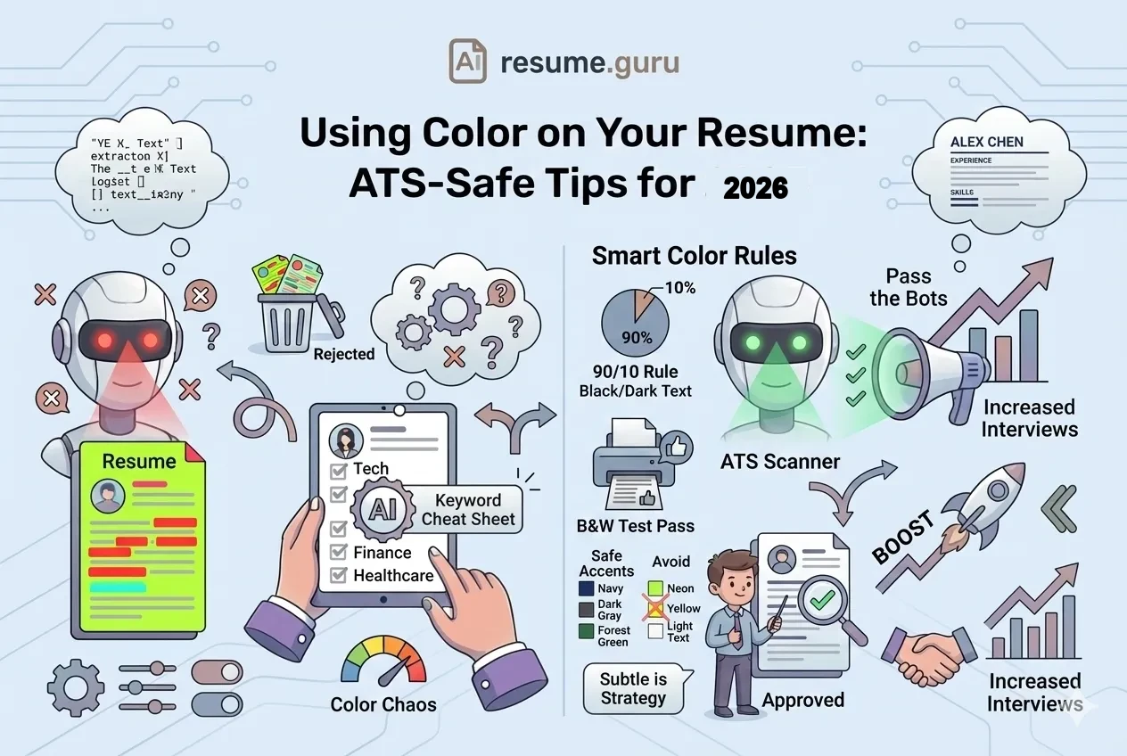
Gone are the days when every resume had to be plain black text on white paper. But there are rules. Break them, and your creative resume becomes an ATS nightmare.
The Quick Rules
- ✅ Subtle color (navy, dark gray, forest green) is professional
- ✅ Use color for headers, lines, and subtle accents
- ❌ Never use light-colored body text
- ❌ Avoid text inside colored boxes or graphics
- ⚠️ Always test by printing in black-and-white
Does Color Break ATS?
The short answer: Not if you do it right.
Modern ATS systems can parse colored text just fine. The problems happen when:
How Color Breaks ATS
- Light text on white (e.g., yellow, light gray) — ATS can't read low-contrast text
- Text inside colored boxes — Many systems can't extract text from shapes
- Text as part of an image — Graphics are invisible to ATS
- Headers in colored blocks — Section titles may not be recognized
What ATS Actually Sees
When you submit a resume, ATS extracts text in order. Color styling is usually stripped out. What matters:
- The text itself is present and readable
- High contrast between text and background
- No text hidden in graphics or shapes
The Safe Approach
Keep all body text black on white background. Use color only for:
- Your name
- Section headers
- Subtle divider lines
- Icons (if any)
The Best Colors for Resumes (By Psychology)
Color psychology is real. Recruiters (unconsciously) associate colors with traits:
| Color | Psychology | Best For |
|---|---|---|
| Navy Blue | Trust, reliability, professionalism | All industries (safest choice) |
| Dark Gray/Charcoal | Sophistication, balance, modernity | Tech, design, corporate |
| Forest Green | Growth, stability, calm | Healthcare, education, sustainability |
| Burgundy/Maroon | Confidence, warmth, tradition | Finance, law, luxury brands |
| Dark Teal | Creativity + professionalism blend | Marketing, creative tech |
Colors to Avoid
Stay Away From These
Too Bright:
- Primary red (aggressive)
- Bright blue (childish)
- Yellow (unreadable, unprofessional)
- Neon anything (overwhelming)
Too Casual:
- Pink (unless creative industry)
- Orange (loud)
- Purple (unless very muted)
Unreadable:
- Light gray (low contrast)
- Pastels for text
Where to Use Color (The Safe Zones)
- 1
Your Name (Header)
Your name can be in navy, dark gray, or another accent color. This makes it stand out at the top of the page.
- 2
Section Headers
'Experience,' 'Education,' 'Skills'—these can use your accent color in bold. Keep them at 14-16pt.
- 3
Subtle Divider Lines
A thin colored line under each section header adds polish without distraction.
- 4
Small Icons (Optional)
Phone, email, LinkedIn icons can match your accent color. Keep them tiny (10-12pt).
- 5
Sidebar Background (If Using Two-Column)
A very light tint (like 5-10% of your accent color) can work—but test heavily.
The 90-10 Rule
Color Ratio
90% of your resume should be black text on white background.
The remaining 10% can use color strategically:
- Name
- Section headers
- 1-2 accent lines
That's it. More than 10% color becomes overwhelming.
Industry-Specific Color Guidelines
| Industry | Color Approach | Recommended Colors |
|---|---|---|
| Finance / Law / Consulting | Conservative (minimal color) | Navy, black, dark gray only |
| Tech / Startups | Modern (some color OK) | Navy, teal, dark blue |
| Healthcare | Professional (subtle color) | Navy, forest green, dark teal |
| Creative / Design / Marketing | Bold (more color OK) | Any professional palette |
| Government / Academia | Very conservative | Minimal—navy accents max |
| Retail / Hospitality | Warm + inviting | Burgundy, warm gray, navy |
When in Doubt
For traditional industries (finance, law, government): Keep it simple. Navy header text, black body, white background. That's it.
You can always go MORE colorful for creative roles—but you can't undo "too casual" for conservative ones.
The Black-and-White Test
Always Do This
Before submitting, print your resume in grayscale (black-and-white).
Why?
- Many recruiters still print resumes
- Some printers don't render color well
- Your design should work without color too
If your resume looks confusing or loses hierarchy in B&W, redesign it.
What to Check in B&W
Black-and-White Test
- Your name is still prominent
- Section headers stand out (bolded or sized up)
- Colored text is still readable (not too light)
- Divider lines are still visible
- Nothing disappears completely
Color Examples: Good vs. Bad
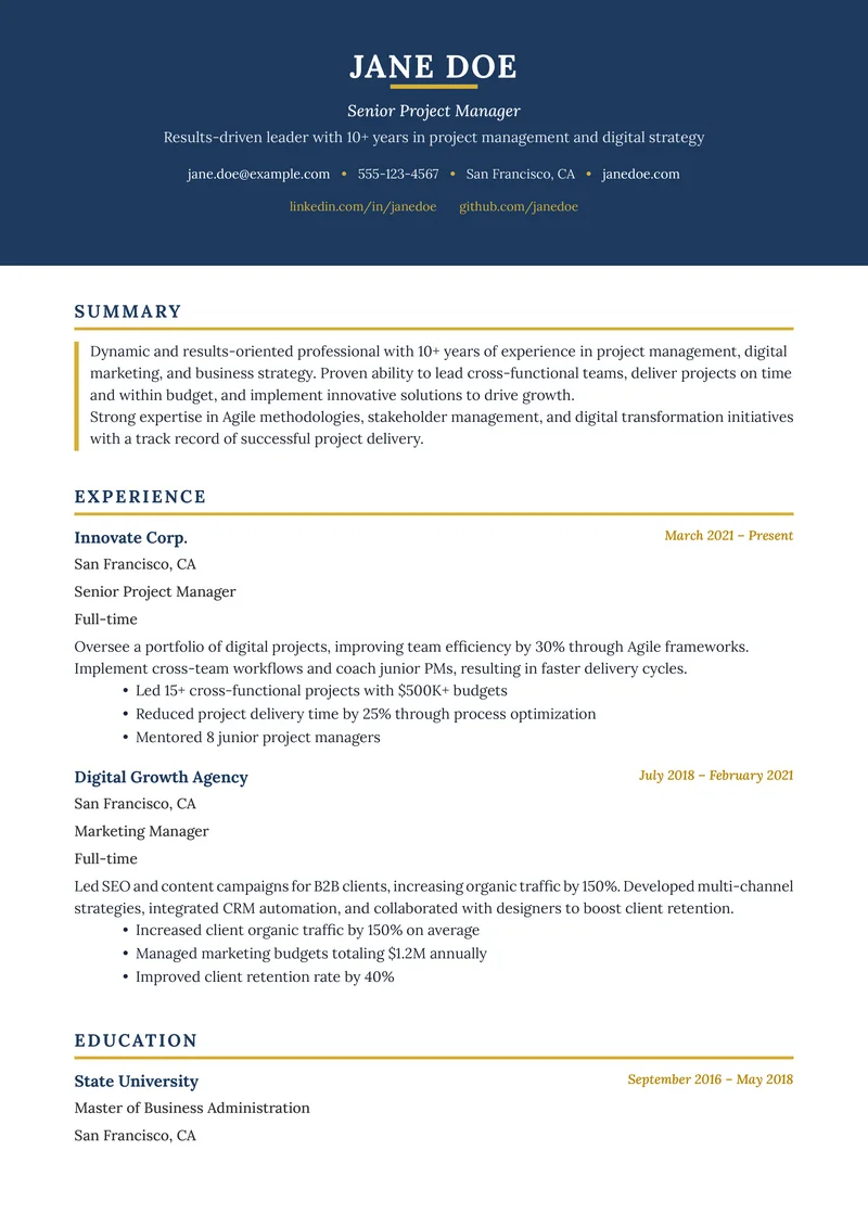
✅ Good: Subtle Navy Accents
┌────────────────────────────────────────┐
│  JOHN SMITH  ← Navy Blue, 22pt Bold    │
│  Software Engineer                     │
│  john@email.com | (555) 123-4567       │
├────────────────────────────────────────┤
│  EXPERIENCE  ← Navy Blue, 14pt Bold    │
│  ────────────  ← Navy thin line        │
│                                        │
│  Senior Developer    (Black, regular)  │
│  • Built APIs serving 5M users...      │
│  • Reduced deployment time by 40%...   │
│                                        │
└────────────────────────────────────────┘
Why it works: Navy provides subtle visual interest. Body text stays black. Hierarchy is clear. Works in B&W.
❌ Bad: Overwhelming Color
┌────────────────────────────────────────┐
│ ██ JOHN SMITH ██  ← Yellow highlight   │
│ ████████████████  ← Red sidebar        │
│ Software Engineer ← Blue text          │
├────────────────────────────────────────┤
│  ░░░░░░░░░░░░░░   ← Purple background  │
│  EXPERIENCE       ← Green header       │
│  ────────────     ← Orange line        │
│                                        │
└────────────────────────────────────────┘
Why it fails: Too many colors. Distracting. Looks unprofessional. ATS may struggle with colored backgrounds.
How to Implement Color in Different Tools
Microsoft Word
- Select text (like your name or headers)
- Home → Font Color → Choose from theme or custom color
- Use "More Colors" for specific hex codes
Safe hex codes:
- Navy: #003366
- Dark Gray: #333333
- Forest Green: #228B22
- Burgundy: #800020
Google Docs
- Highlight text
- A → Text color dropdown
- Click "Custom" for specific colors
Canva
- Select text element
- Use the color picker in the toolbar
- Enter hex code for consistency
ResumeGuru Editor
Select from pre-designed color themes that are already tested for ATS compatibility and print quality. No guesswork needed.
Color for Different Resume Formats
Safe Approaches ✅
- Single-column: Color works well for headers and name
- Two-column: Light sidebar tint can work (test carefully)
- Simple layouts: Any professional accent color is fine
Risky Approaches ❌
- Two-column with heavy sidebar color (ATS parsing issues)
- Infographic resumes with color blocks (text extraction fails)
- Headers inside colored shapes/boxes
Common Color Mistakes
Mistake 1: Matching Company Colors
"I'll use Spotify green since I'm applying to Spotify!"
Don't. It looks like you're trying too hard, and the color may not be professional for a resume context.
Mistake 2: Different Colors for Each Section
Red headers for Experience, blue for Education, green for Skills...
Pick ONE accent color and stick with it. Multiple colors create visual chaos.
Mistake 3: Colored Body Text
Navy bullet points might look nice on screen, but they're harder to read than black—especially printed.
Body text should ALWAYS be black or very dark gray (#333333 at lightest).
Mistake 4: Ignoring Print Quality
What looks great on a screen may look terrible printed. Light colors fade, some blues turn purple, and low-contrast elements disappear.
Quick Reference: Safe Color Specs
| Element | Color Recommendation | Contrast |
|---|---|---|
| Body text | Black (#000000) or dark gray (#333333) | Maximum |
| Section headers | Navy (#003366) or accent color | High |
| Your name | Black, navy, or accent | High |
| Contact info | Black or dark gray | High |
| Divider lines | Accent color or gray | Medium |
| Background | White only | N/A |
The Bottom Line
Color is your friend in 2026—if you use it wisely.
The safe formula:
- Pick ONE accent color (navy, dark gray, forest green)
- Apply it to: name, section headers, divider lines
- Keep body text black
- Test in black-and-white before submitting
Your resume should look polished, not like a coloring book.
Pre-designed color schemes that work
Our resume templates include tested color themes—ATS-safe, print-friendly, and professionally designed.
Browse TemplatesRelated Resources
- Resume Margins, Fonts & Spacing — Complete formatting guide
- ATS-Friendly Resume Guide — Full optimization strategy
- Single vs Double Column Layout — Layout decisions
- Infographic Resumes — When to go visual
- Resume Examples — See color in context
- Resume Templates — Color-safe designs
- AI Resume Builder — Build with tested colors
- Resume Builder — Create with pre-tested colors
- All Resume Tools — Free design & optimization tools
Frequently Asked Questions
Can I use color on my resume in 2026?
Yes—subtle, professional color is fine for most industries. Stick to dark colors (navy, dark gray, forest green) for text and use color sparingly for headers or accents. Avoid neon or bright colors.
Does color affect ATS parsing?
Modern ATS can read colored text as long as there's sufficient contrast. Problems arise with light text on white backgrounds, text inside colored boxes, or graphics containing text. Keep body text black for safety.
What colors are most professional for resumes?
Navy blue, dark gray/charcoal, forest green, burgundy, and dark teal are safe choices. These colors convey professionalism while adding visual interest. Avoid primary colors (bright red, yellow, blue).
Should I submit a colorful resume or black-and-white?
Submit your colorful version as a PDF for online applications. Many recruiters print resumes—your design should look good in both color AND black-and-white. Test by printing a grayscale version.
Build Your Perfect Resume
Create an ATS-optimized resume with our AI-powered builder.
No signup required.Start Building FreeExplore Resources
Enjoyed this article?
Share it with your network
